What Happens First in a Design Project?
This piece answers the question behind the question: “Why does starting feel so overwhelming — and what actually happens first?”
Get to know the order of operations that keeps you from making expensive decisions too soon.
A lot of people come to me with some version of the same question, which is basically: where do we even start? And usually by the time they are asking it, they already have ideas. They have saved things, they have thought about it, and they have a great idea of what they like. They just don’t really know what is supposed to happen first.
I always feel like I need to back up for a second, because what they’re really asking is “why does this feel harder than I thought?
People often assume they’re overwhelmed because they don’t have a clear enough vision, but a lot of the time that’s not really it. More often, it’s that they don’t have an order of operations yet.
And I might be over-explaining that a little, but I see it so consistently that it feels worth saying twice.
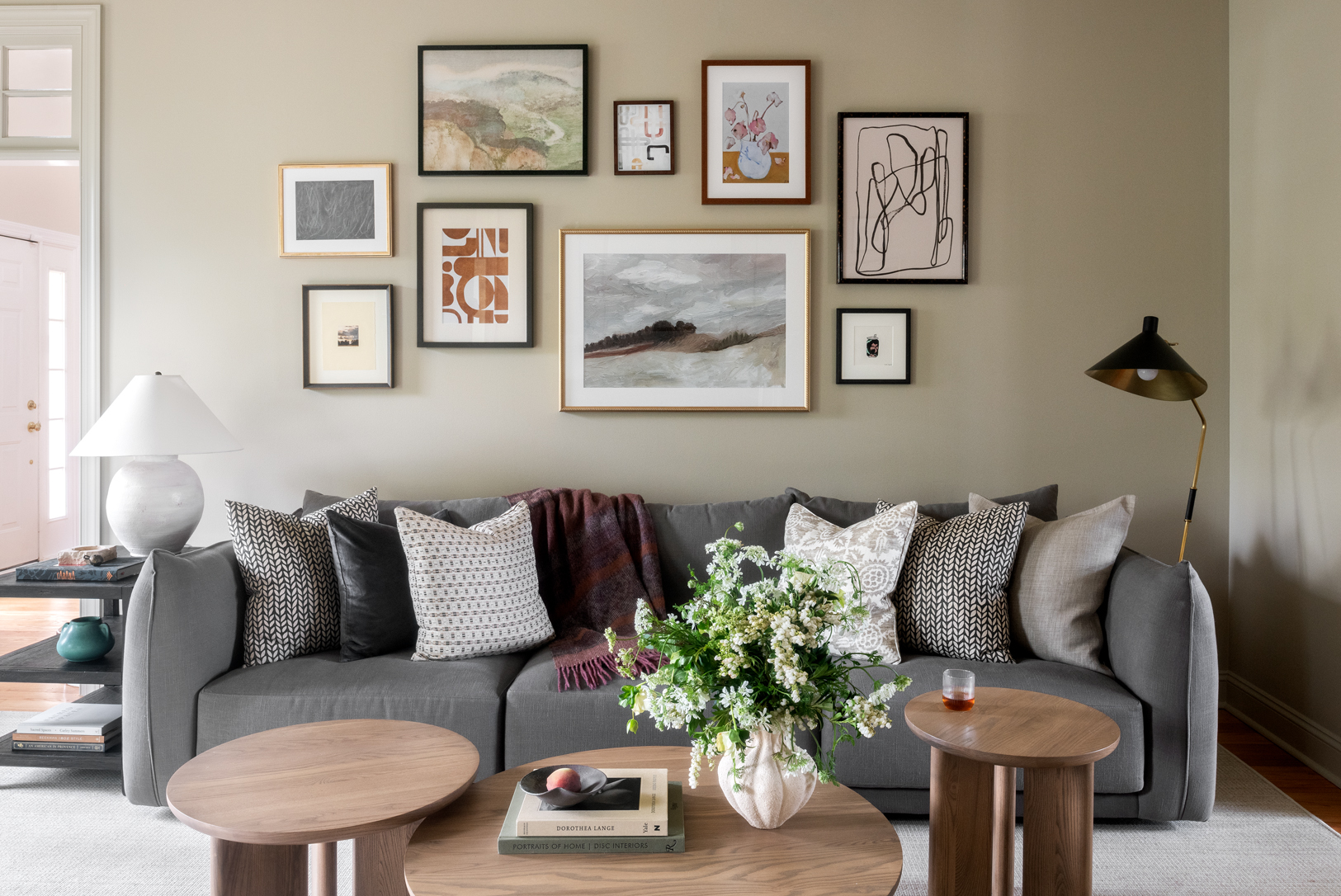
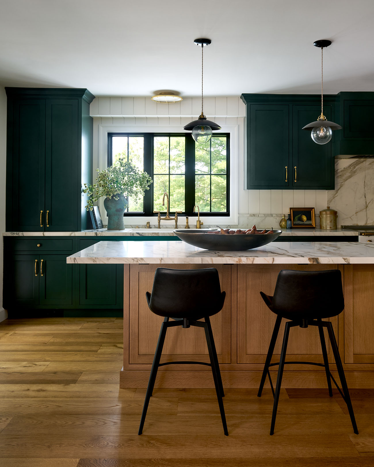
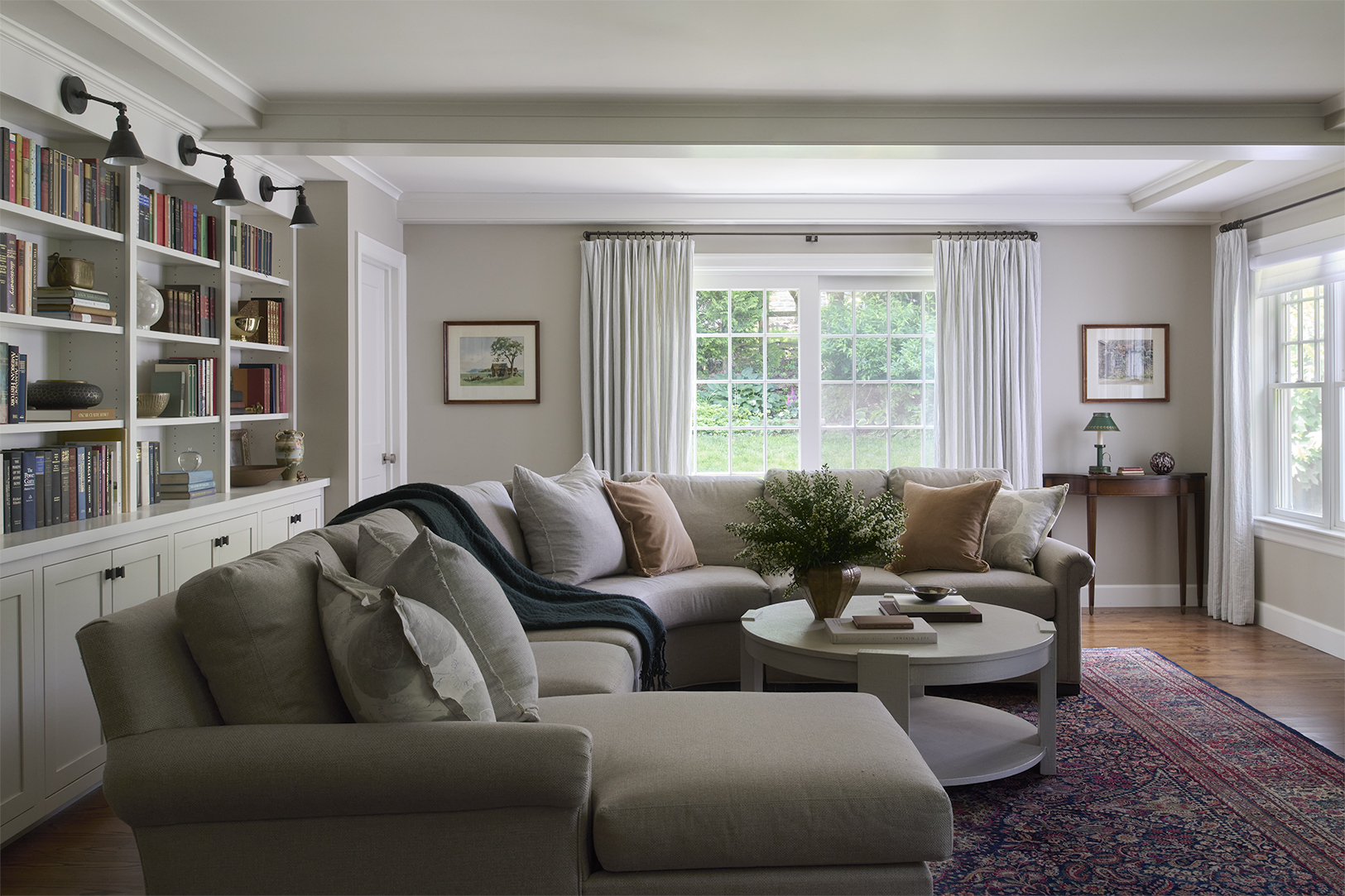
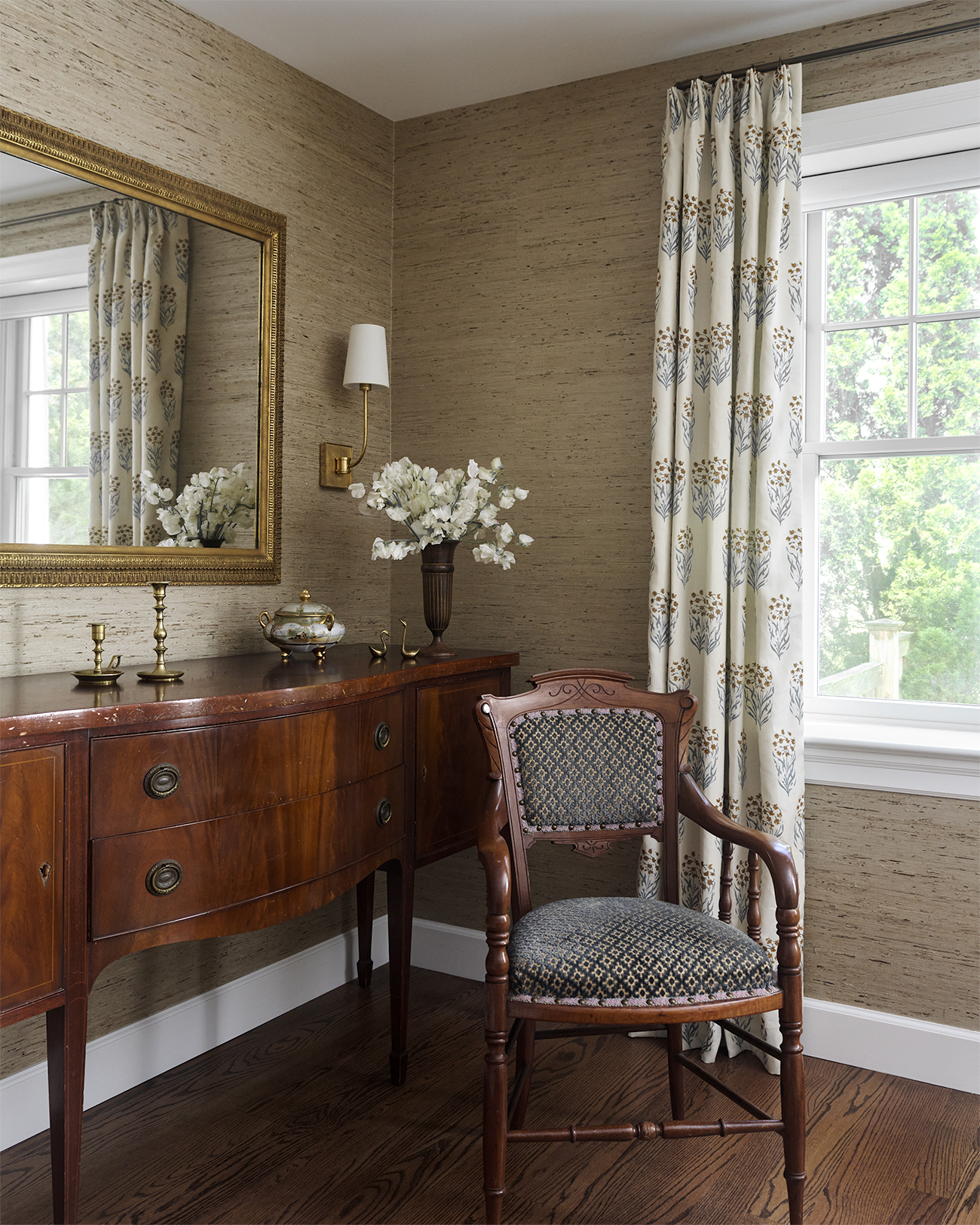
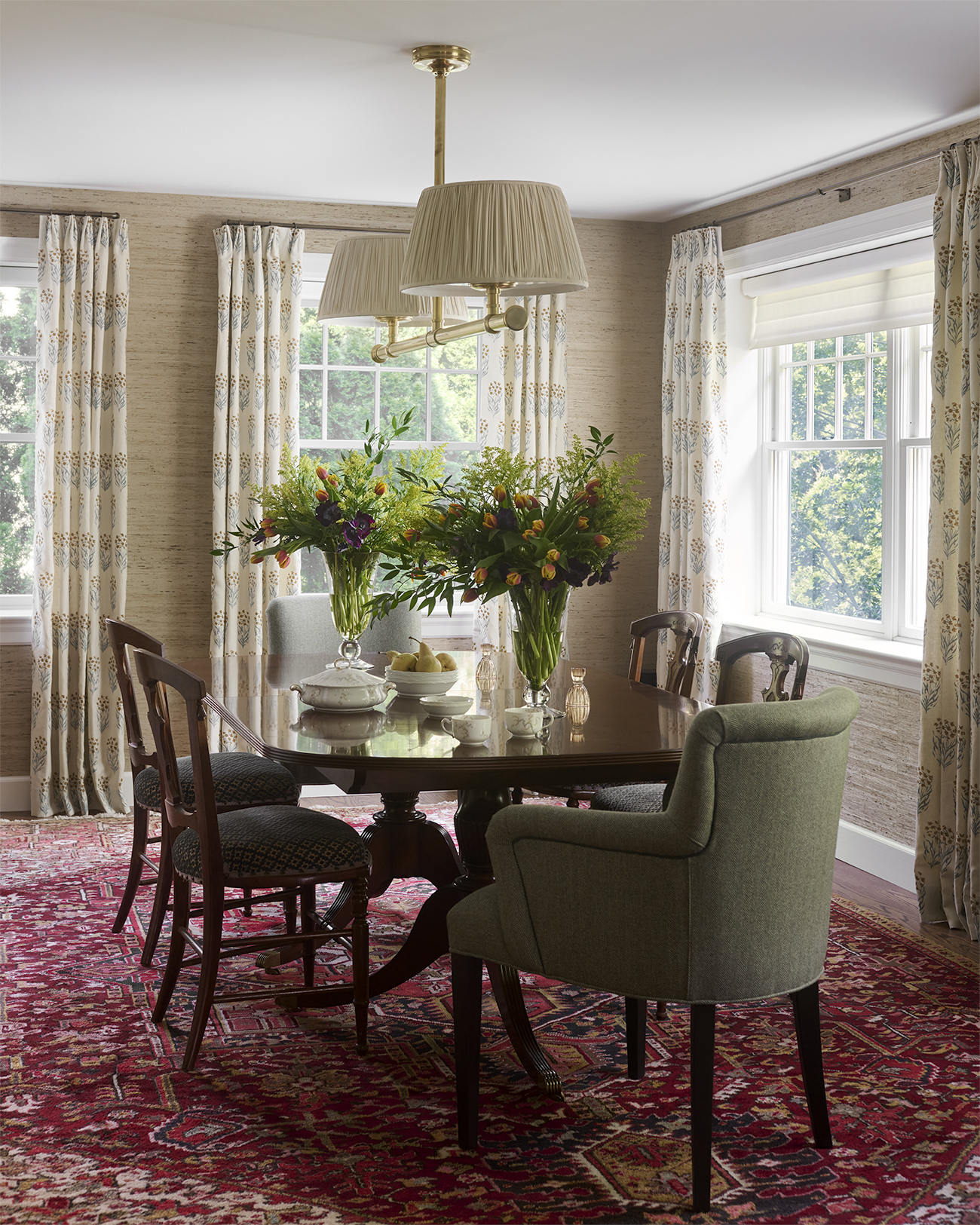
Photos by: Rebecca McAlpin
What throws people off at the beginning
A lot of people think design starts with picking things. They think it starts with the sofa, the rug, the paint color, the light fixture, or whatever pretty thing catches their attention first.
And I get why. Shopping is the tangible part. It is the part you can point to. It feels like progress.
But what so often happens is that one early decision starts dictating everything else before the room has really been understood. Someone buys the sofa because it feels like a good place to start, and then suddenly everything else is trying to work around that one choice. The rug cannot be the right scale, the lighting does not make sense, the layout is still awkward, and the room is being built around one decision that happened too soon.
That is a lot of what I speak about in Design Is a Puzzle. And It’s a Feeling. The room usually is not asking for more things right away. It is asking for a clearer plan.
I see this with clients all the time — they have good instincts, they are drawn to the right things, but the order is not there yet, and that’s where everything starts to feel off.
What I’m paying attention to first
For me, the beginning is much less about what we are buying and much more about what we are understanding.
I’m thinking about how you live in the space, what feels easy already, what is not functioning the way it should, and how you want the home to feel when all of this is done. I am also paying attention to the things that matter emotionally, because that’s important too. Not just what looks nice on paper, but what feels personal, what feels worth keeping, and what actually supports your life. Because the goal is never just a room that looks finished. It is a home that feels like you when you are living in it.
That’s why the beginning of a project matters so much more than people realize. Before we are choosing a bunch of details, we are really building a foundation. We are figuring out what the home needs to do better, what matters most, and what direction actually makes sense.
Sometimes that’s actually a relief for people, because they realize they aren’t behind — they just skipped a step that no one really explains. Or maybe they didn’t even skip it, they just didn’t know it was a step in the first place.
That is also what becomes the basis for a whole-room plan. Every decision can start to support the room as a whole instead of existing as its own little island.
And honestly, if you have read Live Beautifully With What You Already Have, this is the part that comes before the layering. It’s the part where we understand what stays, what shifts, and what the room is actually asking for before we start adding more.
And once that foundation is there, that’s when the concept starts to become useful.
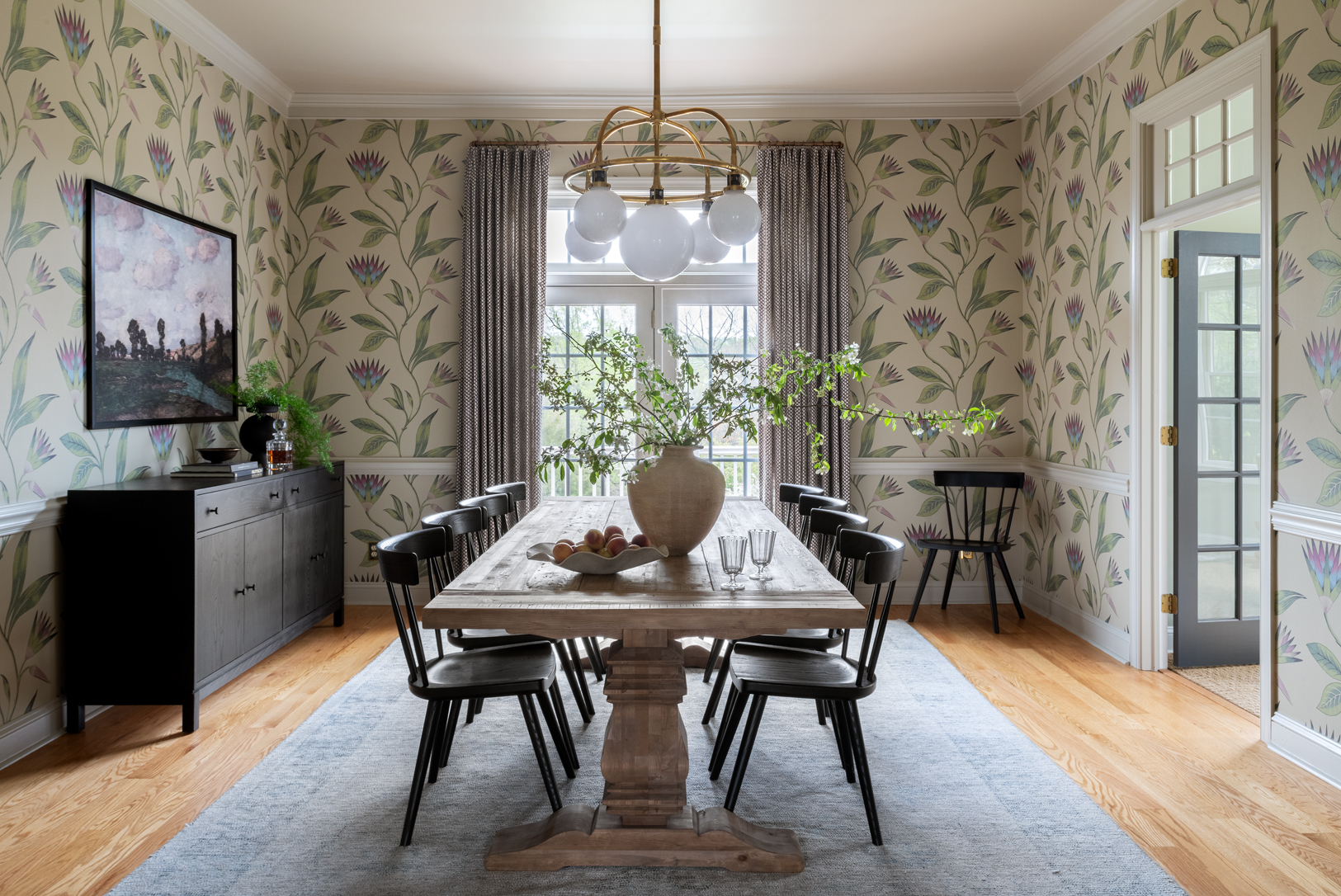
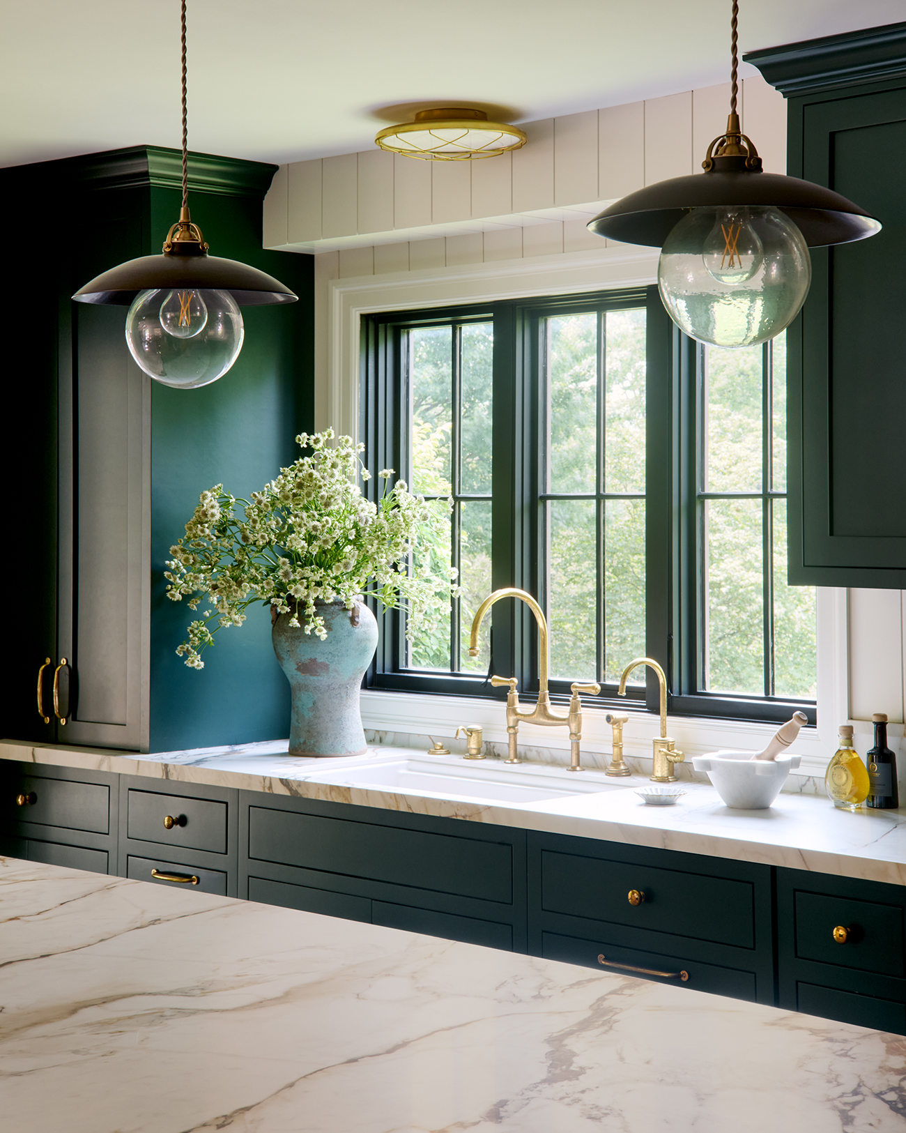
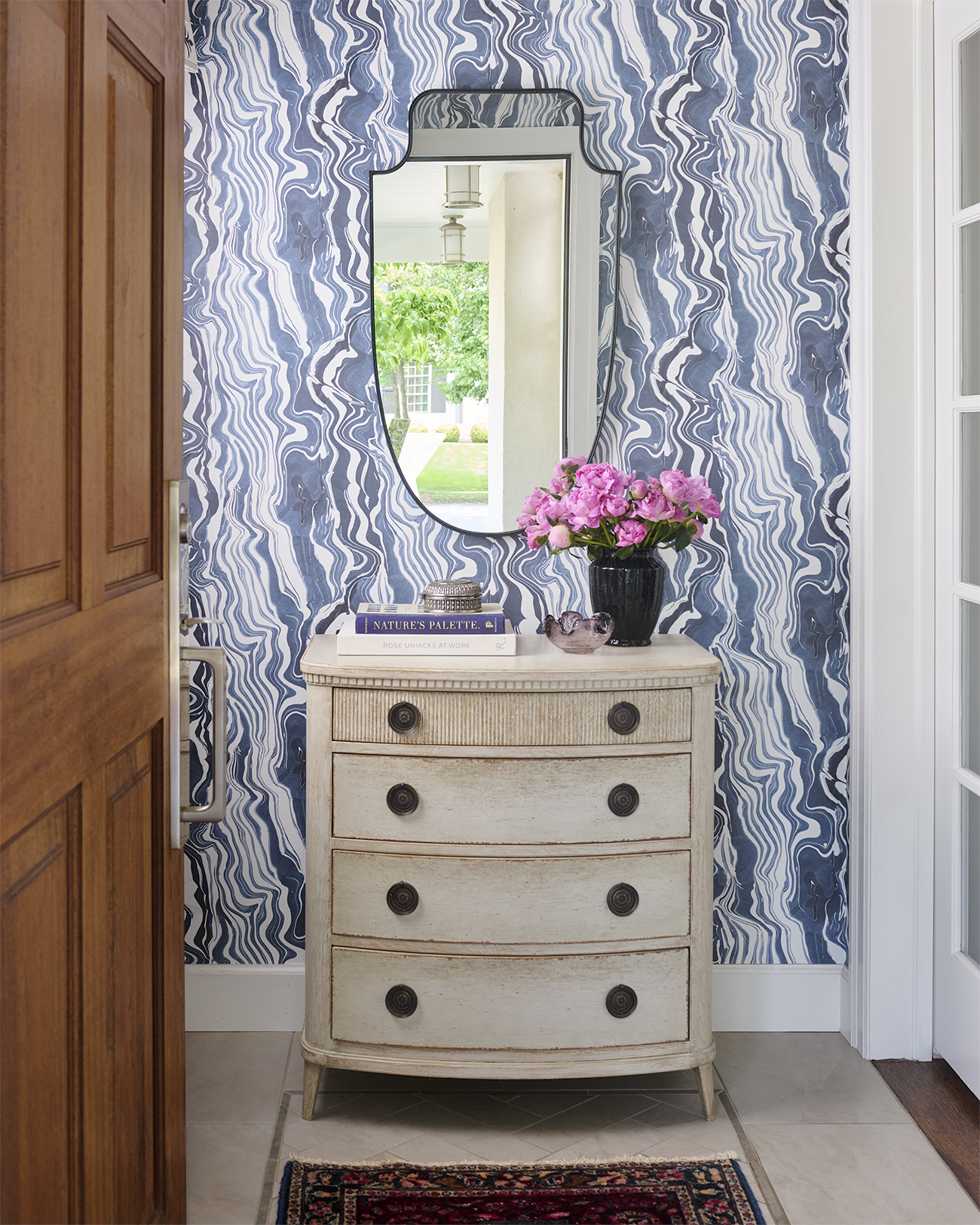
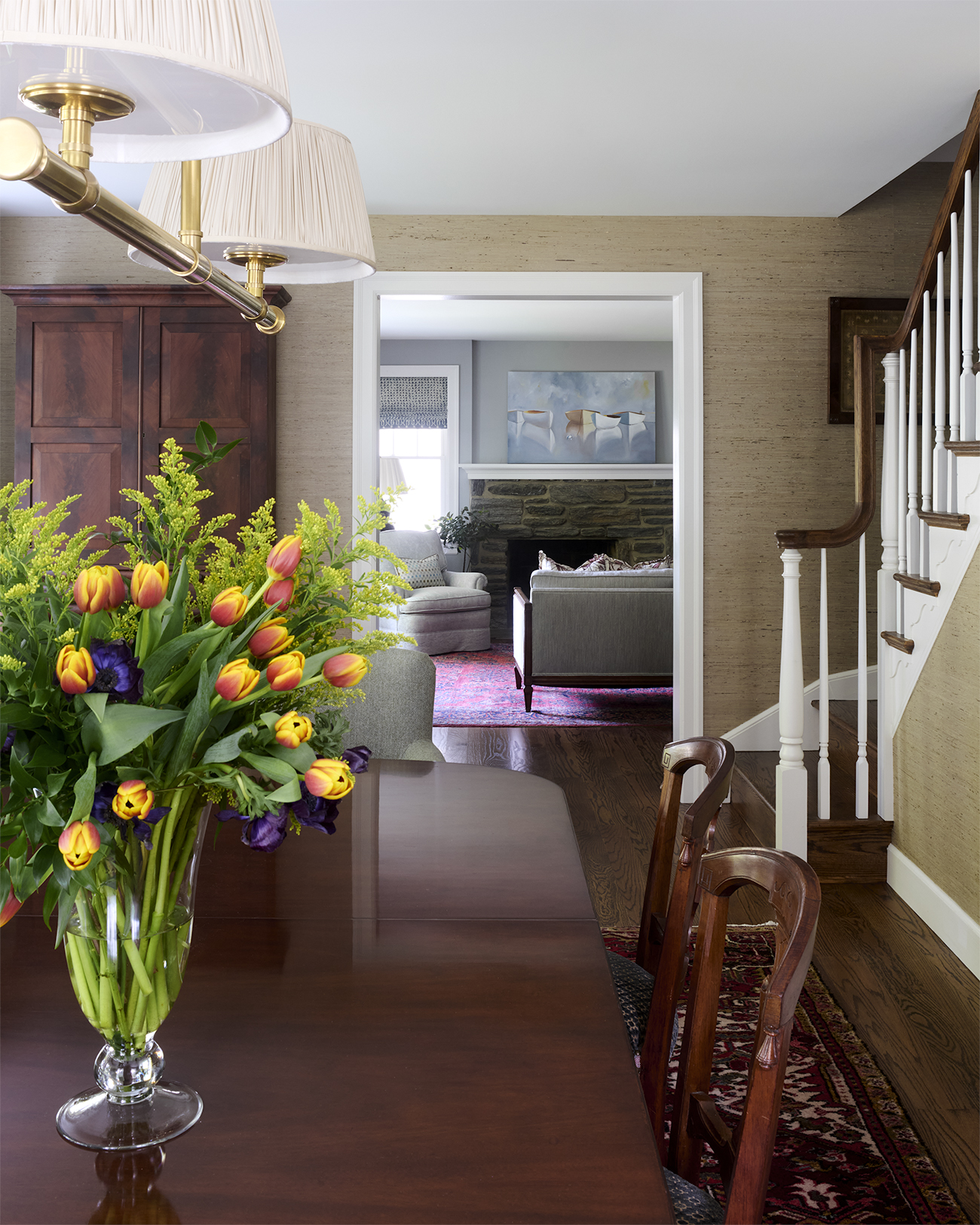
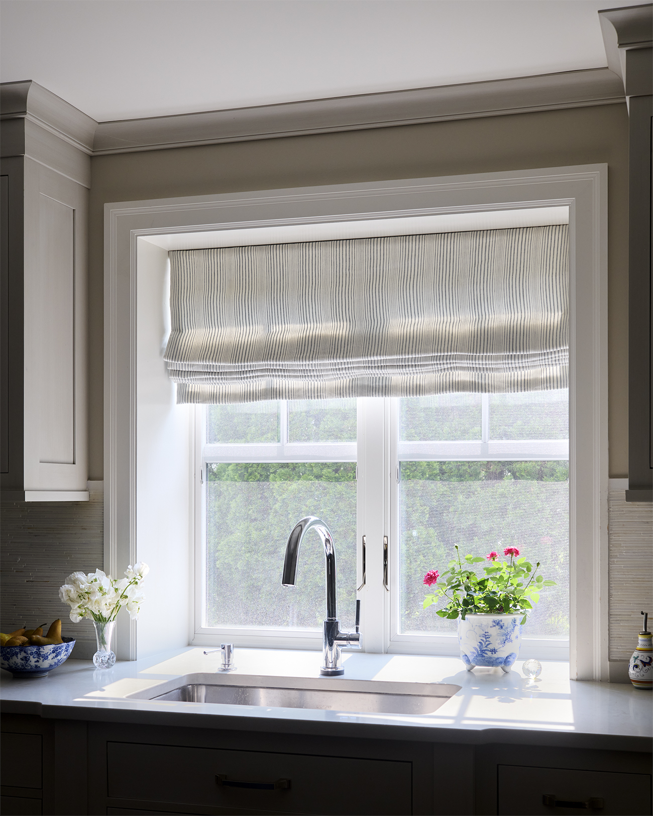
Photos by: Rebecca McAlpin
Why we don’t start with finished decisions
I think this is another part that can feel a little counterintuitive.
People sometimes want to jump straight to finished decisions because they are eager to move, or because they want to feel like something is happening, or because making one decision feels easier than sitting in the uncertainty of the larger process.
But for me, concept comes before details because concept is what gives us direction. It helps us say, okay, this is the feeling, this is the tone, this is the overall approach, this is what we are trying to create.
Once that is clear, the detailed decisions start to feel much more grounded.
Otherwise, you’re just solving the room one item at a time and hoping it all comes together in the end.
Which, to be fair, sometimes it does, but it usually takes longer and costs more to get there.
When there is a concept, and when there is sequence, the process gets calmer. Not because there are fewer decisions in total, but because you are not making all of them at once, and you are not making them without that shared understanding.
What the right order changes
Sequence protects the project and keeps everything running smoothly.
What’s protected:
- Your budget (you’re less likely to buy something twice to force the whole room to work around one early decision.
- The cohesion of your design (because we are looking at the whole picture.)
- Your energy (you’re not trying to solve everything at once, you can breathe and trust in the process)
- Your confidence (every step embraced makes the next one clearer)
This is what it’s about for me, doing the work to keep the project from becoming a series of expensive guesses.
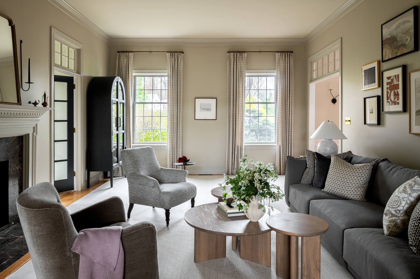
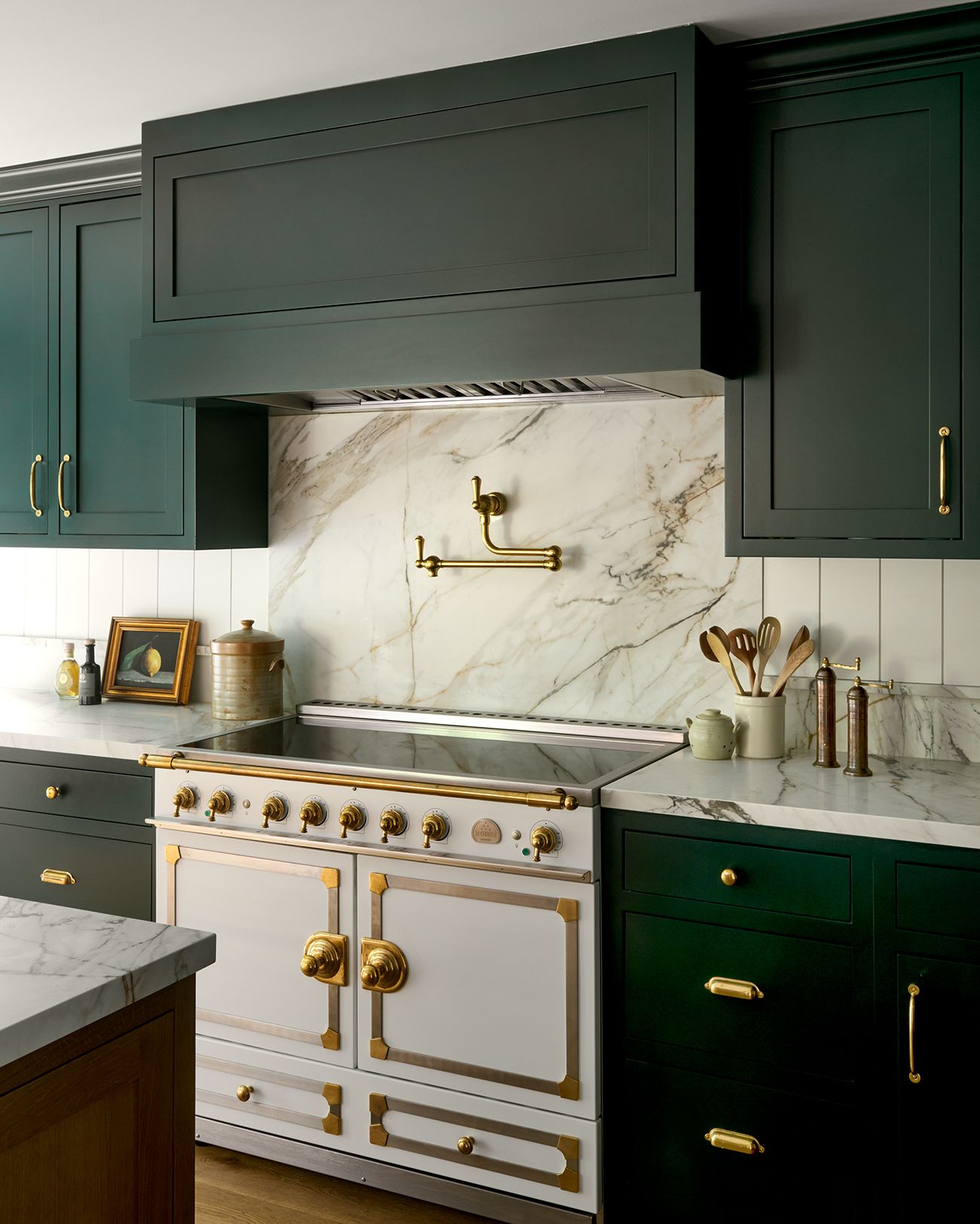
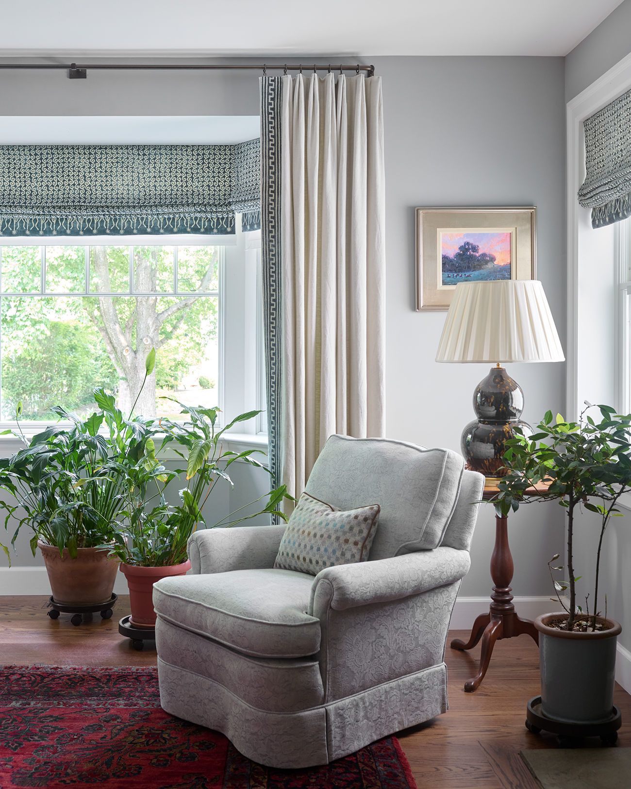
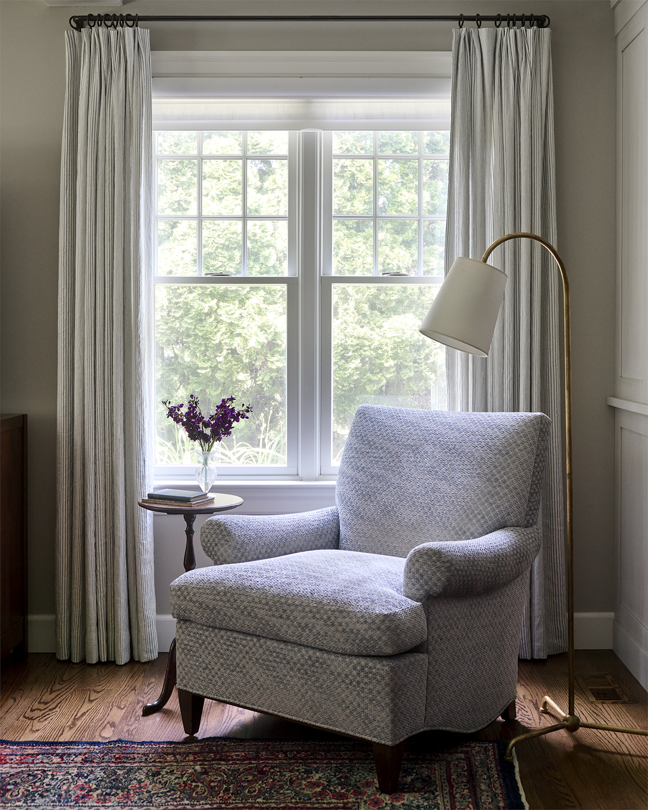
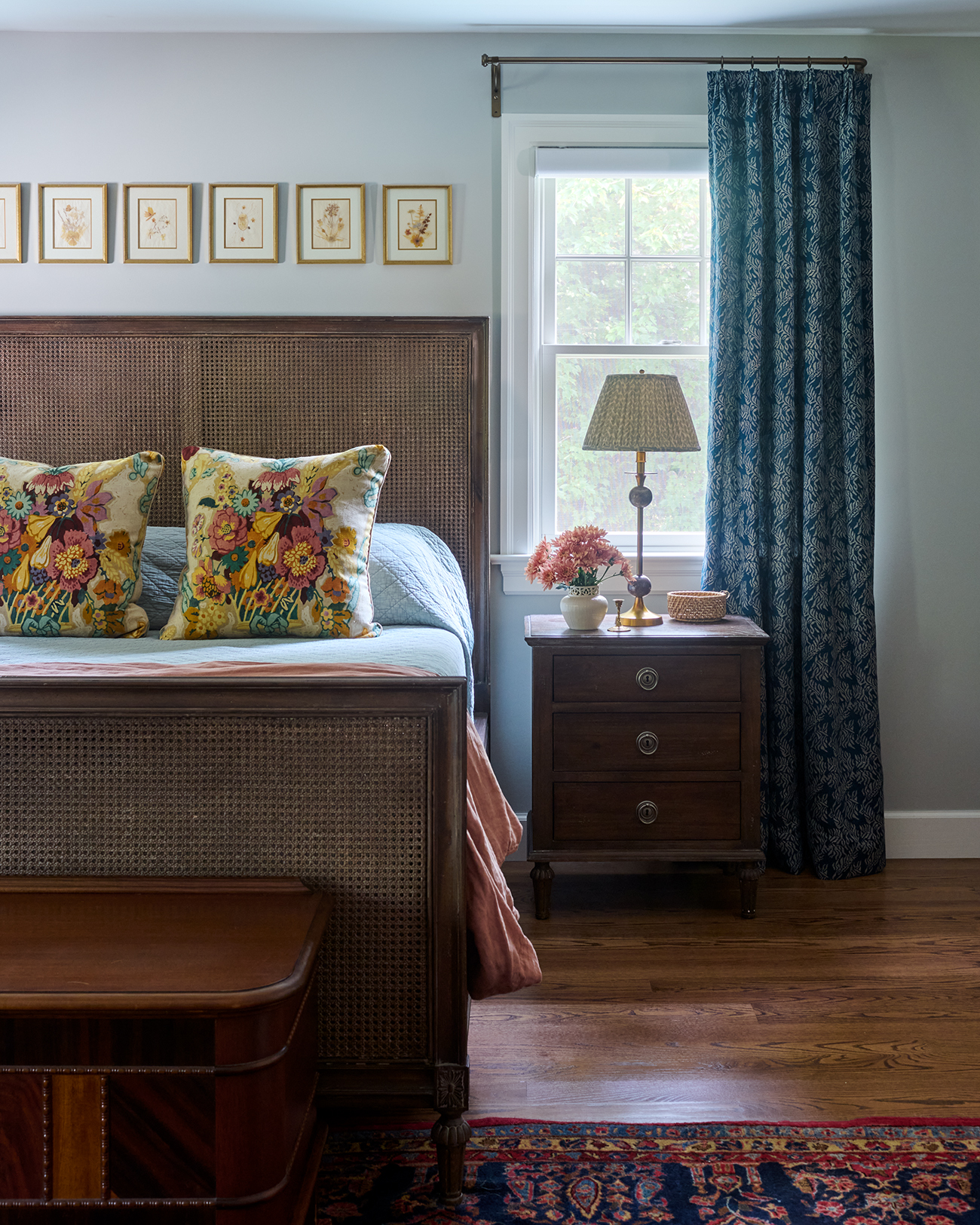
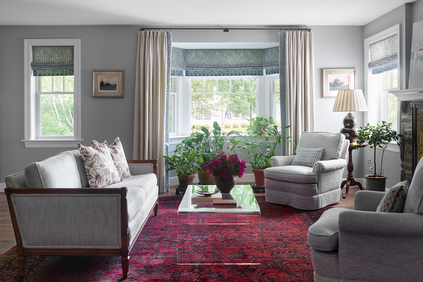
Photos by: Rebecca McAlpin
What’s happening before anything looks finished
This phase can look a little quiet from the outside.There are no deliveries yet. There is nothing really dramatic to point to. But there is actually a lot happening.
I’m listening really carefully and noticing patterns. I’m paying attention to what you keep coming back to, what feels important to you, where the friction is, and what the space seems to be asking for. I’m pulling all of that together and translating it into a direction that can actually be designed.
That work is not the flashy part, but it is a huge part of why the rest of the project can move in a way that feels more grounded and much easier to follow. It’s also a big part of why the finished design feels cohesive instead of pieced together. That’s usually the difference people can feel, even if they cannot immediately explain it: the room feels settled, personal, and much easier to live in.
If you’re feeling stuck at the start
So if you are at the beginning and feeling like you should have this all figured out by now, you don’t.
You don’t need the perfect inspiration board or the perfect sofa to reach out.What is usually more helpful is just being able to say: this is how I want the room to feel, and this is what is not working right now — that’s the best starting point.
And if you want help turning that into a plan, and moving through it in a way that feels thoughtful and guided and a little less overwhelming, reach out to us when you’re ready. A successful project starts with clarity, not shopping — and the order of decisions is what makes everything else work.
Check out our Midland project if you want to see what all the layers look like coming together.
Step inside SafferStyle, the Safferstone newsletter.
Thoughtful notes on home, process, projects, and the details that make a space feel personal, polished, and lived in — delivered monthly(-ish) to your inbox.
Thinking about a project of your own?
If you are beginning to imagine what your home could become, I would love to hear what you are dreaming about, what is not working yet, and how you want the finished space to feel.
Reach out to start the conversation.
Follow Safferstone