Live Beautifully: The Art Of Enough
Living beautifully isn’t about more — it’s about what truly supports you.
From Heather
Live Beautifully – The Art of Enough
Once upon a time, I thought “beautiful” meant brand new.
New sofa. New rug. New everything.
Then I started walking into homes that were full of history… but still didn’t feel like the people who lived there.
Every day, I meet clients who have pieces they love (or feel guilty getting rid of), rooms that “work” on paper, and a house that looks fine in photos… but doesn’t feel quite right in real life. The energy feels flat. The rooms ask a little too much. Things don’t quite support the way they actually live.
What’s missing isn’t more stuff.
It’s alignment.
And alignment starts with a process, not a purchase.
So often, our best work begins with an inventory, not a shopping list. We measure what you already own, map the room, and identify what stays, what gets refreshed, and what’s missing to make everything feel cohesive.
Then we layer in what’s needed:
- The lighting that warms the room at night
- The drapery that softens hard edges
- The textures that bring depth and comfort
- The finishing details that make the space feel intentional
This is the part people don’t see from a “before and after” photo: the decisions in the right order. The calm that comes from knowing what matters and what doesn’t.
At Safferstone, “living beautifully” doesn’t mean starting from scratch.
It means starting with what already matters to you — and building from there.
Over time, I’ve realized that “living beautifully” has less to do with how much you spend… and more to do with how well your space supports the way you actually live.
That’s the quiet luxury of enough.

Photos by: Rebecca McAlpin
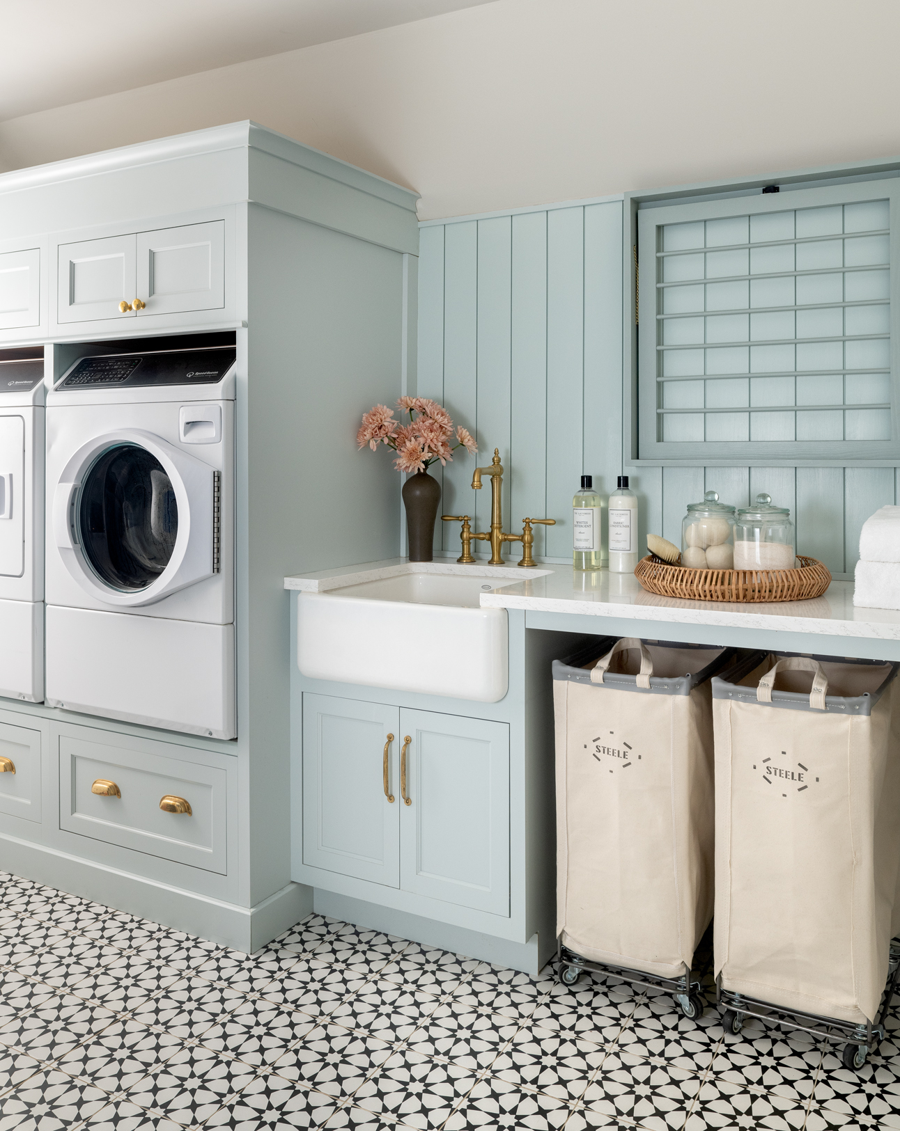
Feature Story
Live Beautifully With What You Already Have
Everyday luxury — without a blank slate.
If you’ve ever shuffled the same stack of mail, walked around the same too-big chair, and thought, “It’s fine… I guess,” this one’s for you.
In this month’s featured guide, I’m sharing how to create everyday luxury using the furniture, decor, and quirks you already own — no demolition, no delivery truck, just intention.
Here’s where to start:
1) Don’t wait for a blank slate
Most real homes are a mix of meaningful pieces, “good enough for now” buys, and things you’re quietly tolerating. You don’t need a perfect starting point.
The magic isn’t in replacing everything.
The magic is in editing and layering with discernment — so what you already have finally makes sense together.
2) Edit with kindness, not guilt
You’re allowed to outgrow your furniture.
Keep what you’d be sad to lose. Relocate what might shine in another room. Release what’s asking too much of you.
“Enough” isn’t deprivation — it’s clarity.
3) Rethink the room before you replace the room
Often it’s not the sofa.
It’s the layout.
A few shifts in placement can turn “this isn’t working” into “oh… there you are.” Flow creates ease — and ease is a form of luxury.
4) Refresh before you rebuy
A piece with good bones can be transformed through reupholstery, refinishing, or the right styling. This is where a home becomes personal — not just new.
5) Layer to elevate
Drapery, lighting, texture, and art are often the difference between “fine” and finished. These are the quiet moves that make a room feel warm, considered, and lived in.
“Living beautifully” isn’t about owning more; it’s about using what you already have, better.
Read the full blog: Live Beautifully With What You Already Have
Want eyes on a room that feels stuck? Reply and tell us which space is asking a little too much right now.

Photos by: Rebecca McAlpin
What if beauty wasn’t something you hunted down, but something you uncovered?
What if it’s already in your home — waiting to be seen in a new way?
Try this:
Walk through your space and ask:
- What am I “putting up with”?
- What would happen if I loved this corner 10% more?
- What feels heavy — and what would feel lighter?
- What if enough… is enough?
Start small. One room and one decision made with care — instead of defaulting to “good enough.”
Closing Note
Living beautifully isn’t about arriving at some final, finished state.
It’s about layering joy.
Lighting the candle. Using the good chair. Choosing pieces because they hold meaning — not just because they’re trendy.
And sometimes? It’s as simple as asking:
What can we do with what you already have — if we had a thoughtful plan?
You can start that process on your own.
And if you want a partner in it, I’m here for that part, too.
Because beauty — real beauty — has roots.
With warmth + intention,
Heather
Interested in getting started? Contact us here.
Interested in getting started? You can contact us here.
Coming Next… Vol. 5: Love Where You Live
February’s issue is a little love letter to the homes that hold us.
We’ll be sharing a client story about meaningful pieces, thoughtful edits, and the moment a home finally felt like home.
Think of it as a Valentine’s Day reminder that the best love stories aren’t just between people — they’re between people and the spaces that care for them.

Photos by: Rebecca McAlpin
If this newsletter brought you a little calm and a little beauty, there’s more where that came from.
Monthly design wisdom, curated finds, and quietly elevated ideas — straight to your inbox.


Follow Safferstone