Color Crush: Pale Pink

Philadelphia “Love Notes” designed for our firm’s new home
We designers often get asked where we find inspiration for a new project. Typically, we start with color. I’ve never been one of those gals who could name a favorite color off the tip of her tongue. There are many I like (most shades of blue, chartreuse, coral, neutrals) only a few I don’t, but rarely can I say I have a favorite. Our current crush: pale pink. Can I call it that? Pantone called it Rose Quartz and named it color of the year in 2016. I know it’s since been deemed “millennial pink”, but that’s always felt a bit narrow to me.
I don’t discriminate among pale pinks. I’m drawn to everything from barely blush to apricot. Quickly becoming a new neutral, I often incorporate pale pinks into projects because they’re so complimentary with other colors and materials. They’re at home with whites, linen, and light neutrals; a bit edgier paired up with brass, tortoise, or black; sweeter with shades of green.
Why pale pink? There’s something simple about it. It’s soothing, happy and makes me smile. It’s charming, romantic, and thought provoking. It’s flattering and suddenly more gender neutral. Unlike other pinks, pale pink is entirely liveable and pleasing. Like dots and animal prints, this organic hue is often found in nature. Think: the best summer sunsets, spring peonies, and fluffy dahlias.
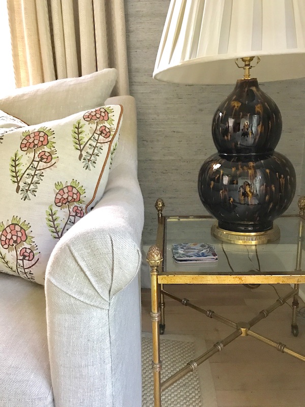
This is a cozy den corner from one of our projects. We love the tiny dose of pale pink in our Tulu Textiles pillows paired up with this beautiful tortoise lamp and repurposed brass end table. We paired it with a neutral wool sisal rug (not shown) and a yummy pale blue grasscloth from Phillip Jeffries. You can see a few more of our in progress pics of this house here.
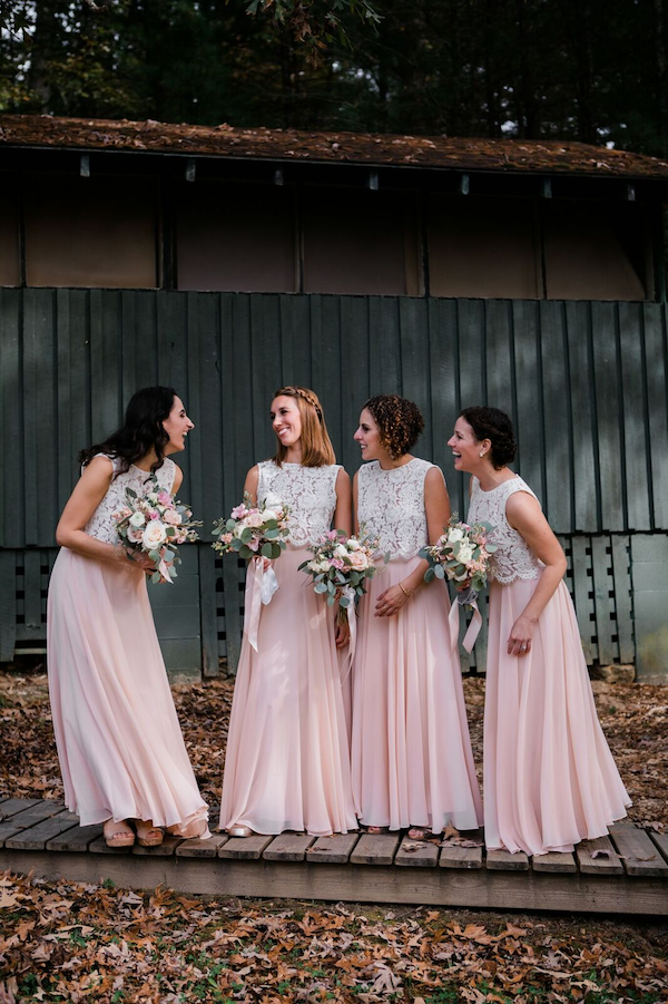
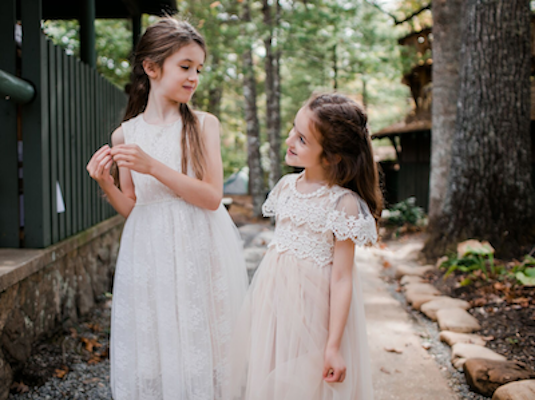
Photos by Bren Photography
I love this color so much that I incorporated it into our Fall wedding last year. It fit right in our natural setting and successfully helped add a bit of romance to our summer camp venue, even for an October wedding. Those are my bestie gal pals above and my nieces here. In all likelihood, the one above on the left is laughing at her own joke.
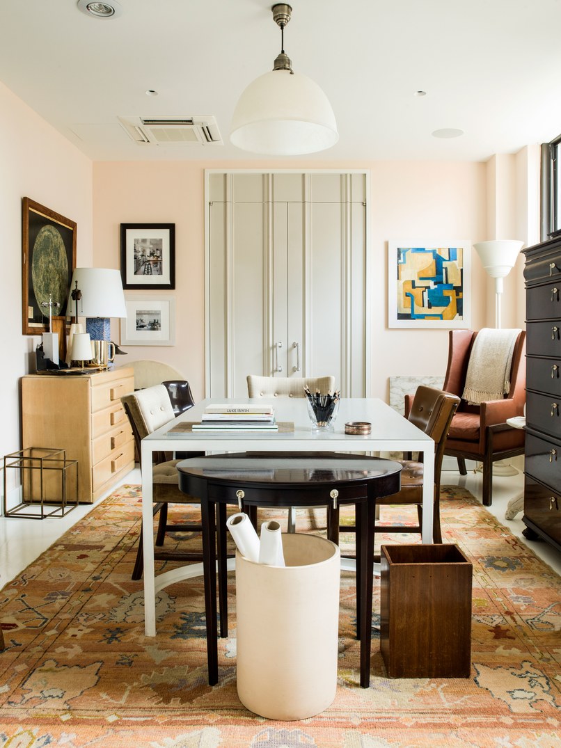
Architectural Digest / Photo by Michelle Arcila
Thomas O’Brian, a numero uno design idol, painted his new offices for Aero Studios in NY Benjamin Moore’s Tissue Pink. This man does no wrong! I love how they paired their pink with chalky whites and other shades of blush and apricot. Their use of vintage, handmade, leather and contrasting materials makes the color a chic backdrop that doesn’t come across as too sweet.
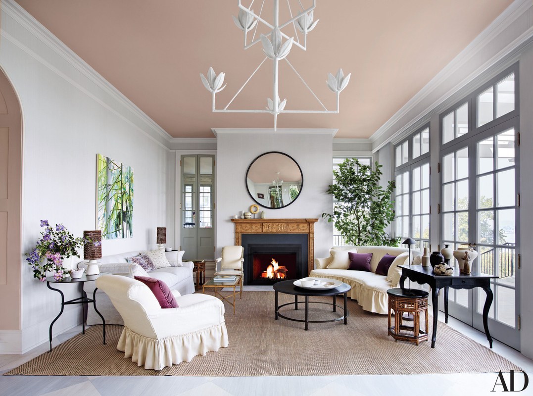
Source: Architectural Digest / Interior Design by Jeffrey Billhuber
Jeffrey Billhuber painted this ceiling in a renovated 1908 Seattle Colonial in Farrow & Ball’s Setting Plaster. The color gives the otherwise quiet room a subtle lift, adding to the airy feel of the space. This house is stunning, no surprise. Read the full story here.
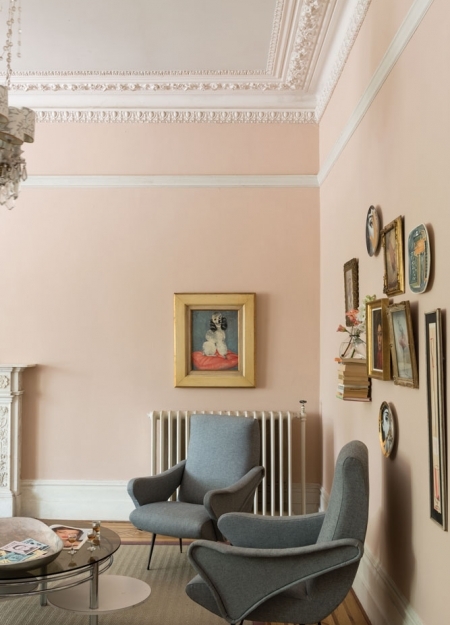
Farrow & Ball “Setting Plaster”
Another use of Setting Plaster, via Farrow & Ball’s website. I love the color here with those big moldings and otherwise eclectic decor. It feels like a neutral wall, but more optimistic.
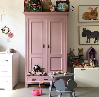
Source: Mini Mode
A vintage armoire gets a facelift via Farrow & Ball’s Cinder Rose. I love how it’s the only pink in the space and is unexpected next to those fuzzy animal paintings.
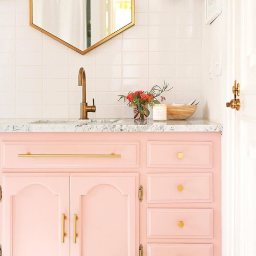
Design by Elsie Larson / Photo by Amber Ulmer
What a statement! Would you ever be so brave? I love the combo of this vintage pink paired with natural stone and natural brass hardware.
Interior Design by Melissa Lenox / Photos by Katie Charlotte
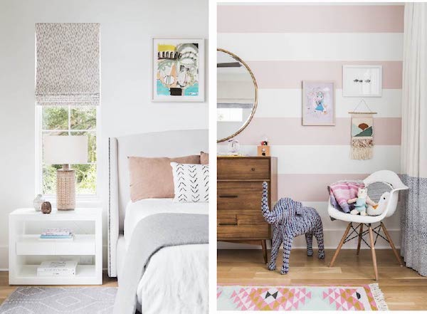
Two ultra charming spaces from designer Melissa Lenox’s Modern Farmhouse project in Charleston incorporate pale pink. In the master bedroom, Simple solid shams plus a textural lamp contribute a warm dose of color to an otherwise white space. And let me file that nursery under future baby girl room inspo. So sweet. I often think of rugby stripes as a bit too preppy, but not here.
Source: @asimplerdesign
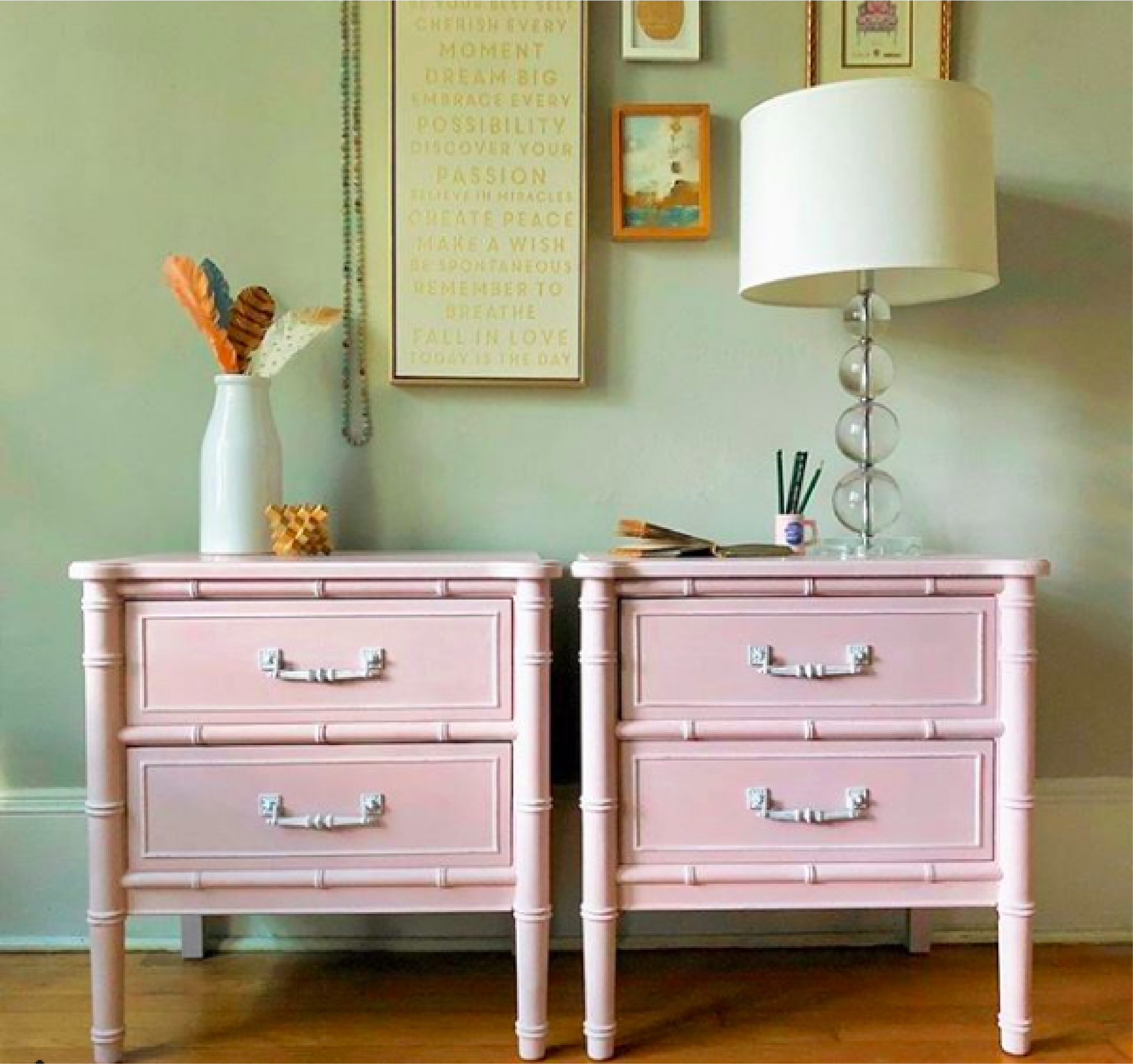
This painter, @asimplerdesign, updated a pair of faux bamboo nightstands with Annie Sloan Chalk Paint in Antoinette. I’d love to put a big patterned headboard in between these with neutral bedding.
No color love post would be complete without our favorite pale pink paint colors. Here are the ones currently topping our list.

We’re loving all the pale pink we’re seeing in interiors lately. It’s a welcome breath of fresh air, like we’re not taking ourselves too seriously, and I think most of us could use that. I’ve been using it mostly as a small dose of color here and there in our projects, but I’d love to try it soon as a neutral wall color or to update a vintage case piece. Tell me how you’ve been using pale pink lately in the comments below.
Stay in touch! Subscribe or contact us & say hi.
xx,
Heather
Follow Safferstone