A Dreamer’s Kitchen
July 27, 2020
Do you ever catch yourself staring at your kitchen, dreaming about the possibilities, wondering what it would be like given you had the (fill in the blank) to redesign or renovate it?
Two years ago we bought a 1940s Colonial that has a quaint farmhouse feel but needs a looot of work, so this is something I do a lot (the standing and staring).
HBS Home, a kitchen & bath showroom here in Bucks County, PA is a stunning custom cabinet shop right around the corner from us in Newtown. They asked me to create a conceptual kitchen design to display on the gallery wall in their showroom. Typically busy with our clients’ projects, my own are usually shoved to the bottom of the list (don’t ask me about the sheets hanging over my bedroom windows). Since I don’t have a client on this project, I took the opportunity to dream up a plan for myself. It was exciting in that I finally set aside time to think about what I would actually like some of our renovations to look like one day. Not only has that been a nice distraction during the Covid quarantine, but it enables me to consider our priorities, construct a budget, and assess the next projects in our home in an informed manner.
Below I’ll walk you through the design, which highlights my detailed selections and a peek into our design planning process.
To start, we partnered with Countryside Gallery on State St and I selected a watercolor by local artist Judy La Torreat to set the tone for our design direction. It reminded me of some of the old barns we see while walking in Tyler State Park so was an easy choice.
Robert Kramer from HBS helped me with the cabinet plans and I selected all the materials needed for a Kitchen with an adjacent mud room, butler’s pantry, and powder room. I like to start projects by asking how we want to feel in the space when it’s completed. In my own future Kitchen, I’d like the design of the space to evoke an effortless vibe that’s chic, bright, airy, and classic (also organization is key for creating a sense of calm. Read: storage, storage, more storage). While we want to make some broad updates to our home, we won’t ever gut renovate it. I’d want an updated kitchen that is not only pretty, but enhances the existing architecture. Our Kitchen & Breakfast Room area are right inside our front door so it’s the first thing you see when entering our house; it should set the tone for the overall look & feel of our home.
Prioritizing selections that are little traditional mixed with a few clean lined pieces keep the overall design of the space classic while not getting too fussy. This approach fits the design of our little Colonial farmhouse well.
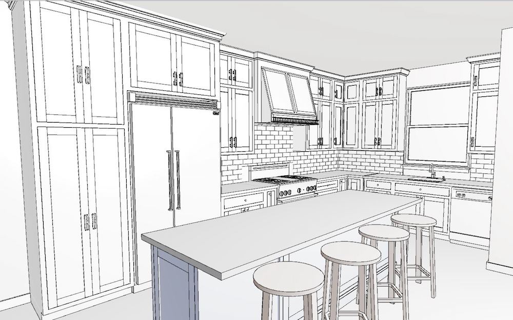
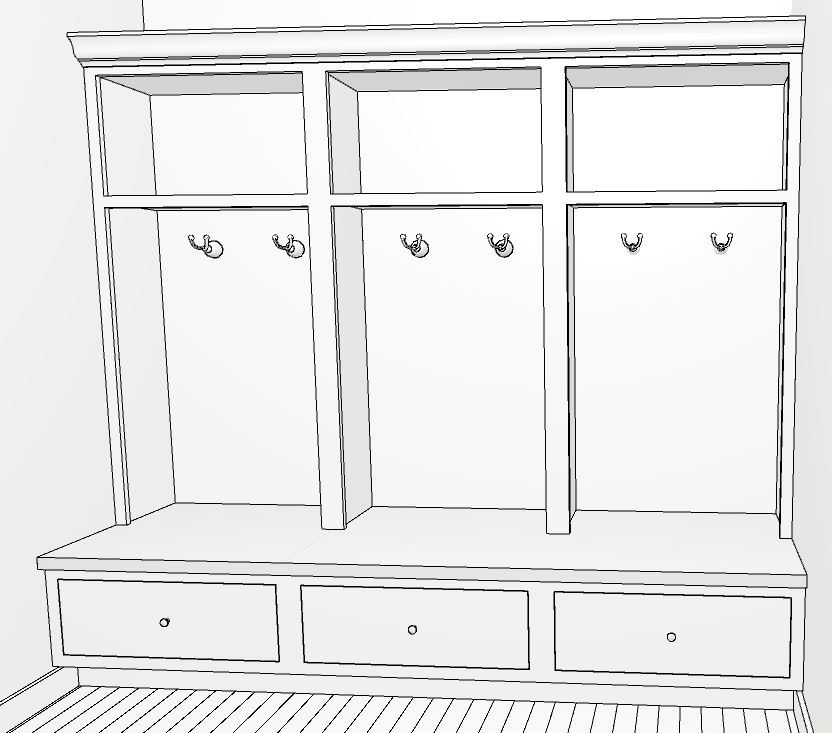
Below is the Kitchen rendering from Robert. There’s wrap around cabinetry, a window over the kitchen sink, and a generous island. I mentioned storage, so I’d opt for upper cabinetry around the full perimeter. One could swap out upper cabinets for floating white oak shelves here if you wanted a lighter look and had less to store.
Here’s the design plan with my selected materials:
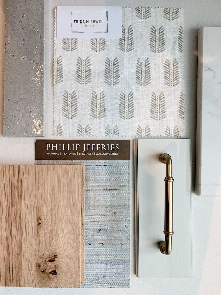
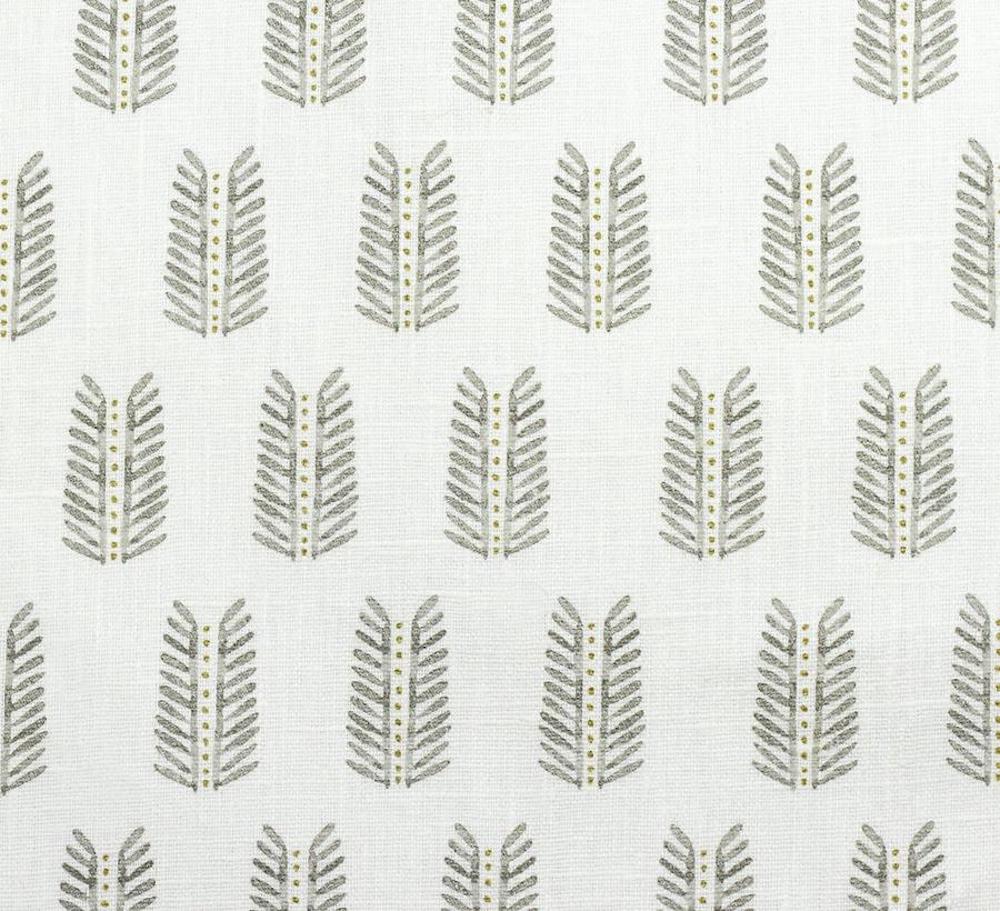
I like starting design plans with textiles & patterns I know I want to incorporate and build from there. To add a little softness to the windows, I selected a print from Erika Powell Textiles with a neutral leaf pattern and crisp white linen ground. I’d add a tape trim on three sides to ground the pattern and define it from the window trim.
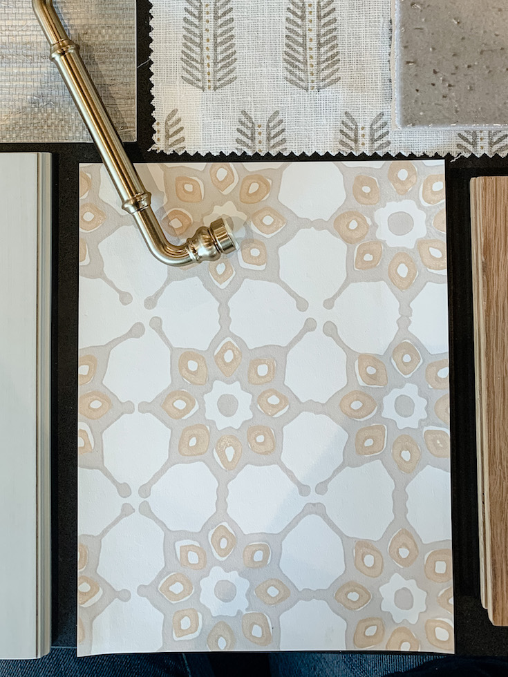
I also know that I’d want to wallpaper the nearby powder room, so I’ve paired Galbraith & Paul’s Tile pattern in a complementary neutral. This colorway beautifully marries gray & beige, a combo I come back to again and again and nods to the leaf pattern in the Kitchen.
I selected a cabinet style from QCCI in their finish called Village Misty Harbor. I selected a recessed panel door (modern, clean design) with an ogee along the inside edge of the door to give it a little detail (steering us towards the classic/traditional side). The finish is a light white/gray color (not pure white) and has a nice strie to it. It reads bright & airy but feels a little different from the all white kitchen. Since our conceptual plans include a mudroom with cabinetry adjacent to the Kitchen, I’ll use a contrasting charcoal color on the Kitchen island that we tie in via the cabinetry in the mudroom.
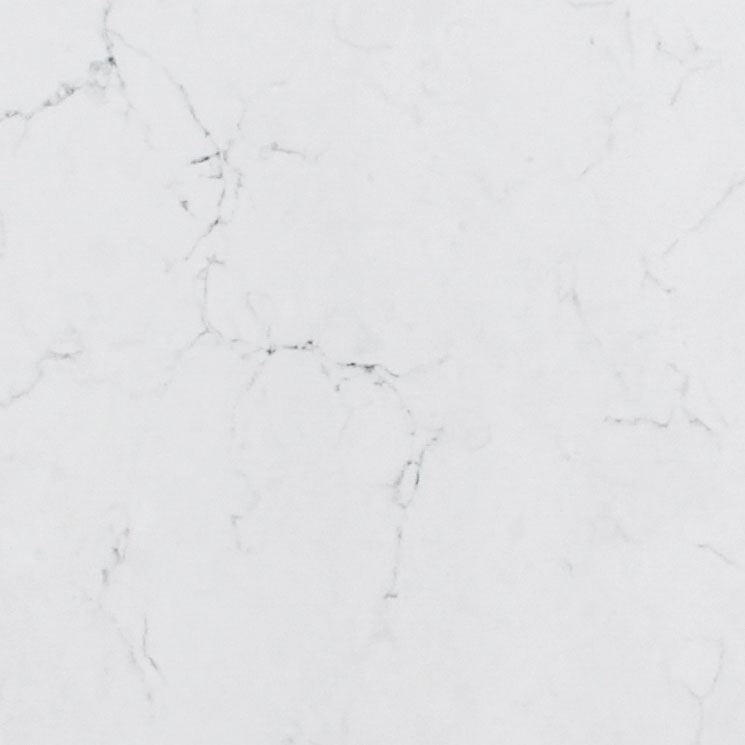
I chose a Pental quartz for the countertop called “Misterio Polished”. It’s a nice clean white with some small brown & black veining marks. I truly love marble, but at this stage in our life I’d opt for quartz in this house.
I chose a 3×8 glazed brick in a warm gray color for the backsplash that I sourced from Princeton Stone & Tile. I love the tumbled, organic dimension it adds, and the taupe color gives us a little contrast & interest over the white counters.
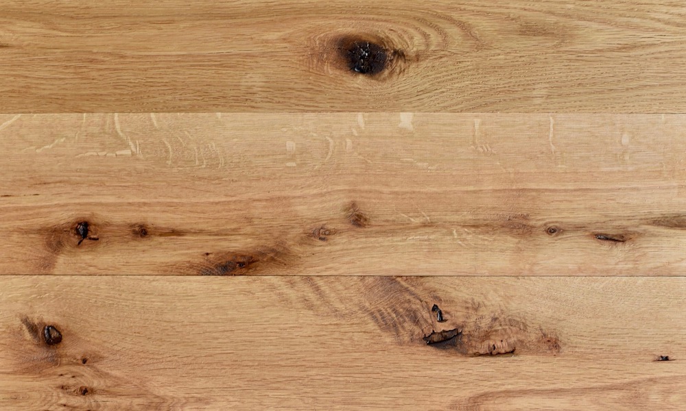
Our first floor is home to three different types of flooring: brick in our big family room, old wood in the center area, and slate in the kitchen. To update and make the space more uniform I’d love to replace all of it with reclaimed white oak in a wide plank throughout the entire space. Our house isn’t huge so I’d prefer to keep the plank size at no greater than 5″ wide. The sample I have shown is from Brick & Board, a very cool shop out of Baltimore that salvages materials from old buildings around the area before demolition.
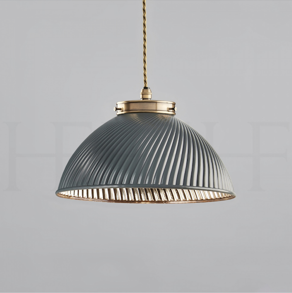
To illuminate the isand workstation I chose the Tiber Pendant from Hector Finch (a personal favorite). I love the simple shape with that special fluted detail, subtle color on the exterior, and warm brass finish on the inside.
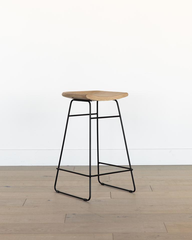
The barstools are an iron base with a wood seat via McGee & Co. I like that they give us a little dose of cool with a slightly industrial design. I envision a little patina and wear on them over the years as we use them, otherwise easy to clean and maintain.
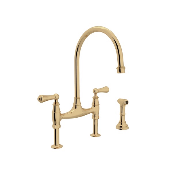
The Kitchen Faucet I selected is a bridge design from Rohl in Unlacquered Brass. Adding a more traditional faucet here keeps the space feeling classic and contributes to that sense of the home’s original architecture & character. I’ll tie in more of the brass with cabinet hardware.
I chose the Brixton handles from Top Knobs in their Honey Bronze finish. I typically like a big handle, around 6”, if doors are tall enough. I often turn handles for drawer pulls instead of using knobs so I’ll do that here. Lastly in the Kitchen, I chose a greige paint color from Benjamin Moore for the remaining wall space called “Pale Oak”.

Last but not least, the mudroom. This is more of a “just for fun” because I don’t think we would take this project on in this house, but we’re dreaming right so I’d love to add a mudroom adjacent to our Kitchen one day. That space would give us a dedicated entry plus organize all our needs outside of the rooms on our first floor. I’d love to have laundry on the 2nd floor, but again, probably not possible in this house. In the meantime, it lives in our basement so moving it to the first floor/mudroom would be a big win. The mudroom would then help us accomplish our laundry chores, but also provide storage and organization for all the things (kitchen overflow, toys, lawn games, winter gear, shoes, and so on).
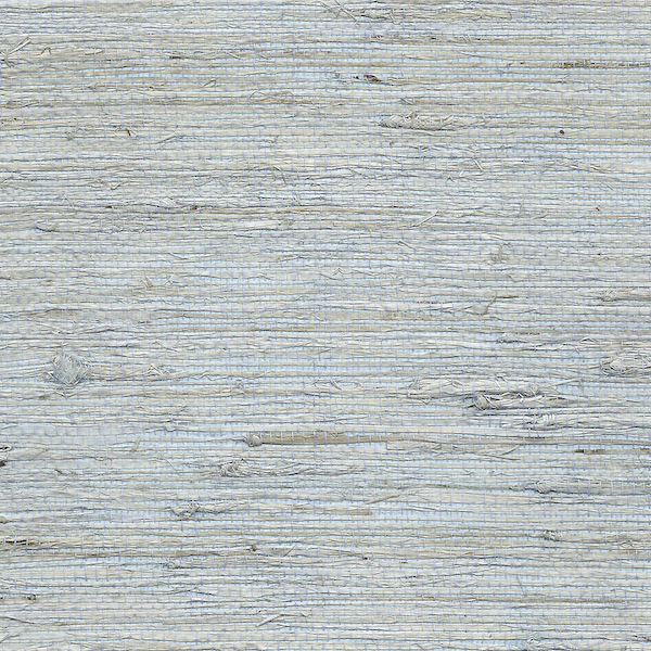
As mentioned above, I chose a dark charcoal finish for the mudroom cabinetry. I’d run the same white oak flooring here and would use an antique brass hook for the cubbies. To add a little texture & interest to the space, I’d love to incorporate a grasscloth for the walls. I chose a personal favorite, Phillip Jeffries’ Extra Fine Arrowroot in the prettiest pale blue color called Solitude (don’t miss the “installation photos” tab at that link).
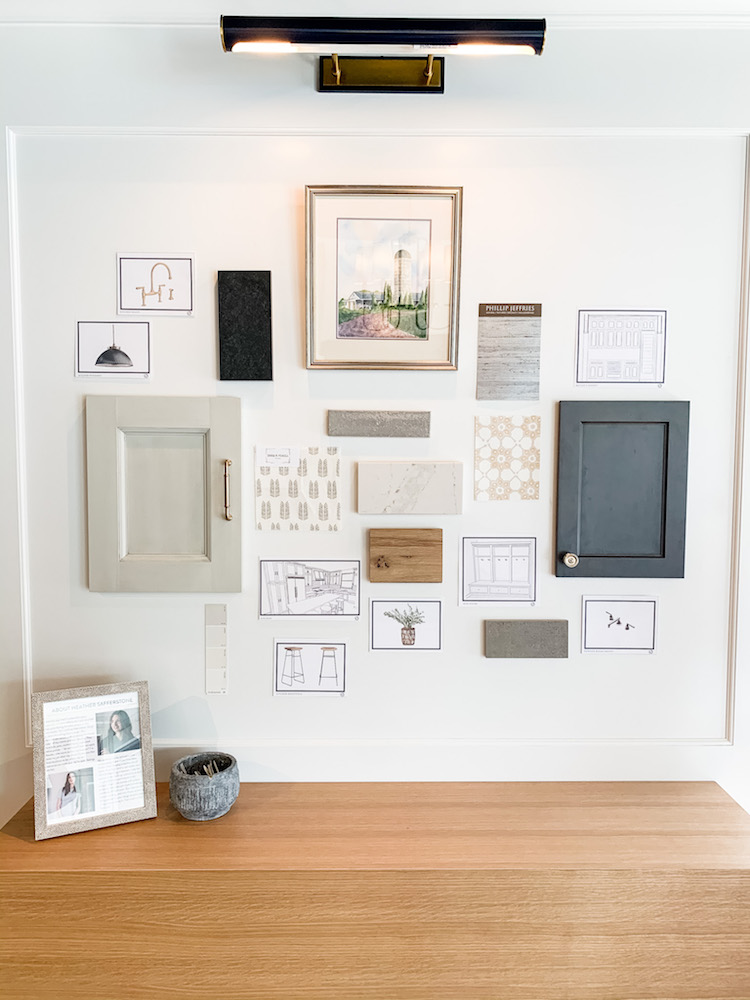
Below is the final design as displayed on the HBS Gallery Wall:
Getting a plan out of your head and onto paper before you are knee deep in construction deadlines will save you a lot of stress and money. If you could use help with selections for your own renovation or new build, get in touch & tell me what’s on your plate. I’d love to help breathe some fresh ideas into your standing and staring dreams, too.
xx,
Heather
Follow Safferstone