My unabashed favoritism for patterns with dots
October 9, 2017
I have this thing with dots.
They’re the ideal small scale pattern, a perfect way to introduce a little something without going overboard or being too plain. They’re cute, happy, and fresh, but there’s a range of course.
Keep in mind, I ain’t talkin polka; think little dots, or abstract ones. The more irregular the better. Maybe it’s because they seem hand drawn, or remind me of something you might find in nature, like an animal skin.
Below is a roundup of some of my favorites out there and where they come from. Enjoy!
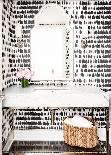
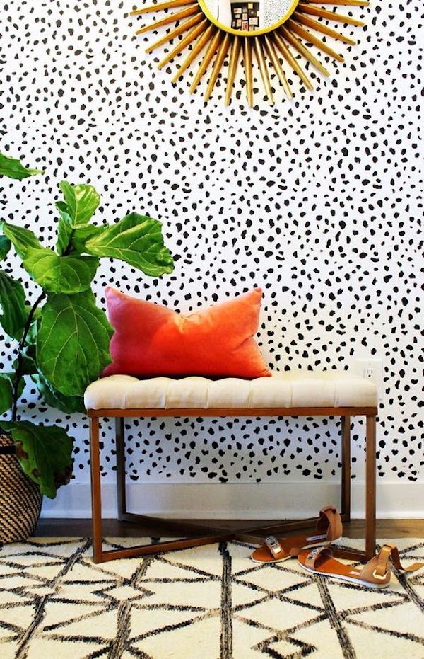
Photo: Stephanie Buchman Source: My Domaine
I’m currently coveting Schumacher’s Queen of Spain wallpaper. It looks super sharp here as the backdrop in this black & white bathroom dream come true. A pattern like this offers a grittiness to an otherwise very pretty space, like adding something a little tough with sweeter elements. I find it keeps things edgy, like wearing an old baseball tee with the perfect pair of Italian leather pumps.
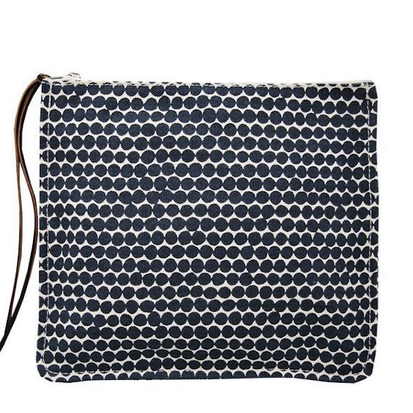
From one of my go-to all time favorite fabric lines, Hable Construction’s Charcoal Checker pattern is shown here as a pouch, but I’d likely use it as a clutch. This do-no-wrong pattern is also available as pillows, bins, totes and fabric by the yard and suffice to say is a frequent go-to in our studio. The line is family owned by sisters Katharine & Susan Hable. Their patterns are based on original illustrations by Susan Hable Smith, hand drawn in their Athens, GA studio.
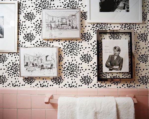
Source: Lonny
Albert Hadley’s iconic Fireworks pattern is timeless here in this pink-tiled bathroom with vintage sketches by the designer himself. Even Martha approves.
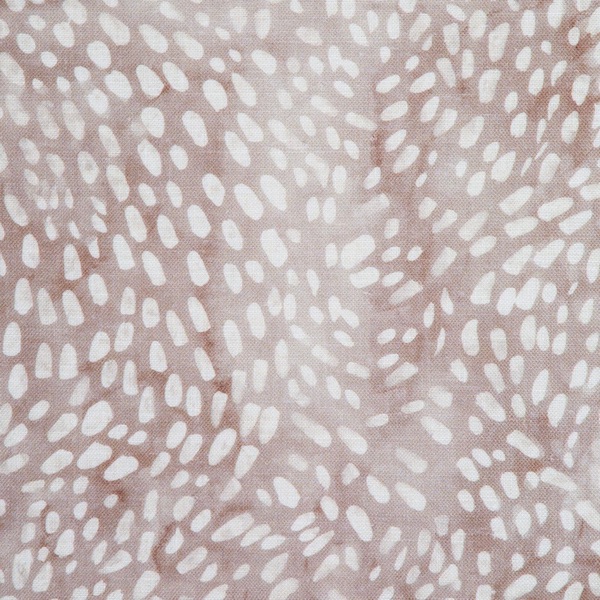
One dear to my heart is Rebecca Atwood’s Speckled in Taupe/Fawn. This pattern began as an ink wash with hand painted marks on top that reference seeds tossed into the wind, then the artwork is digitally printed onto linen. I used this pattern in a recent project and I loved it so much I just couldn’t bring myself to take the sample off my desk. I bought enough yardage to make napkins for the head table at my upcoming wedding. My thought is that it’ll provide a tiny dose of pattern to our otherwise fairly simple tablescapes. Things we’re mixing with it include: gray, blush, white ceramics, glass hurricanes, lots of tapers, and rose gold votives.
Source: www.isuwanee.com
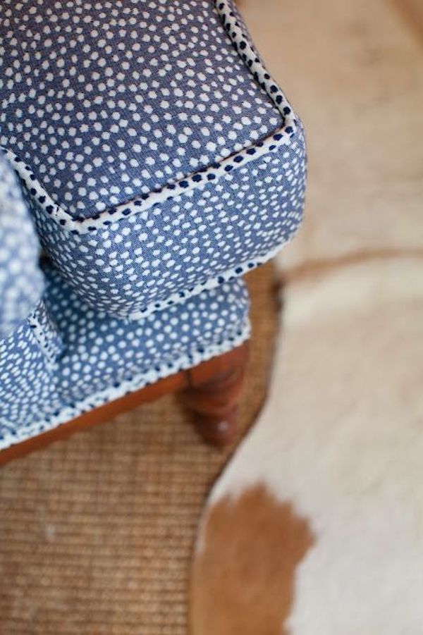
I love the clever use of the same dot pattern on the reverse for the welt of this vintage chair by Furbish Studio. Hmm, or maybe that’s another color way? There’s an effortless intention here that adds depth to this piece.
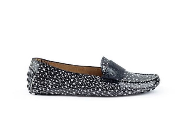
Yowsa, thanks Matt Bernson. I’ve had loafers on my mind recently because I’m on the go a lot more with work and projects in multiple cities. I’ll take cute and comfortable any day. The NY brand is topping my list at the moment. If you have tiny tootsies, snap the last of these up!
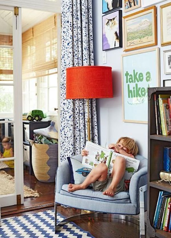
Photo: Ashley Gieseking
I love this splatter dots pattern hanging in this boy’s room by designer Amie Corley. Such a unique twist on the more expected stripe, check, or plain. They blend seamlessly with other patterns in the space and also with that playful gallery wall.
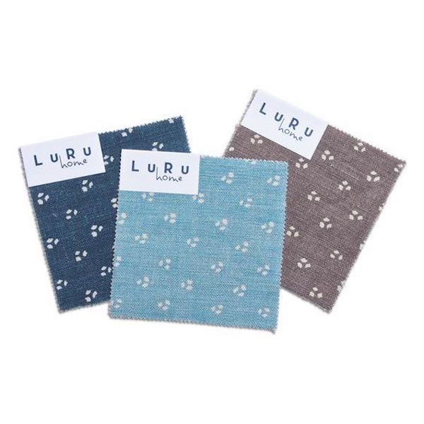
I came across Luru Home at Studio Four in NYC last year. Their charming “Three Friends” print here represents three Chinese plants often observed together withstanding harsh winter conditions. Cute, right? More on the creative duo behind the line here.
This list wouldn’t be complete without something leopard. Thibaut’s Tanzania is a staple in our wallpaper drawer. The scale is fantastic; I could easily see a whole slew of art hanging over it. It’d balance well with another paper or pattern nearby, like shown.
A great dots pattern is one that’s playful but refined at the same time: cute but not juvenile; chic yet simple. They often fill the gap for me when I need another layer but don’t want something too typical. Finding the right time & place to use them is about balance. Put simply, I find that they add an unexpected happy moment with each use.
How will you use your own favorite dots today? Share with me in the comments below.
Want more? Subscribe or Contact Us to say hello.
xx,
Heather
Follow Safferstone